

Showing posts with label Digital Painting. Show all posts
Showing posts with label Digital Painting. Show all posts
Wednesday, November 19, 2014


Wednesday, July 16, 2014


Monday, July 14, 2014
Going Painterly
Well in the never ending quest for self improvement, today I attempted a quick study with the goal of making the illustration look more painterly. Painterly can mean many things but in this instance, I wanted to push my photoshop skills and try to paint like I would with the real thing. This meant more controlled / confident brush strokes ( not so many searching marks and less CTRL Z), less concern with modeling the forms and more focus on value and edges. Not bad for a first go and I intend to do more down the road so stay tuned for more.
I've included a second version with the direct reference as comparison and yes, I did use the color picker.
Also, I tossed in a few pictures from my sketchbook. Go Green Ranger!
Enjoy


I've included a second version with the direct reference as comparison and yes, I did use the color picker.
Also, I tossed in a few pictures from my sketchbook. Go Green Ranger!
Enjoy
Wednesday, March 19, 2014
My favorite Movie 1987 " The Predator"
Oh Man how I love this flick. I don't think it is possible to get sick of this movie and I could not resist creating this faux movie poster. The premise was for me to go " full struzan" and do a Study using his technique. Well, as per usual, I went "whole hog" and created my version of the movie poster for this classic. I managed to squeeze the whole cast in except for the general. Even Hopper made it !;)
Anyways, here is the image and some process shots.
Final Image
Anyways, here is the image and some process shots.
Final Image
 |
| Final Illustration |
 |
| Line Under Drawing |
 |
| Initial color lay in with the Air brush |
 |
| Final Pencils w/o adjustments |
 |
| Blaine Detail |
Tuesday, October 29, 2013
Catra Fan Art
"Rwowrr... I'll get you SHE-RA!"
Lol, I've been watching a lot of She Ra with my Daughter lately. It's her favorite show and she even had a She Ra themed birthday. Most of the kids her age have no clue who She Ra is and I just love it that my girl likes and watches the same shows that I did when I was a kid. So, we watch a lot of Motu shows and I decided to do some fan art. I was inspired by this guy I found on deviantart who goes by the handle AldgerRelpha and his Motu fan art is fantastic. Anyways, in my spare time I've been noodling around with this image and I finally had the time to wrap it up and post it. I figured that I'd start with an Evil Villain before I moved onto a Heroic Hero. I've got a couple more in the works so stand by for more and let me know if you like it and if there are any characters that you'd like to see.
Cheers!

Lol, I've been watching a lot of She Ra with my Daughter lately. It's her favorite show and she even had a She Ra themed birthday. Most of the kids her age have no clue who She Ra is and I just love it that my girl likes and watches the same shows that I did when I was a kid. So, we watch a lot of Motu shows and I decided to do some fan art. I was inspired by this guy I found on deviantart who goes by the handle AldgerRelpha and his Motu fan art is fantastic. Anyways, in my spare time I've been noodling around with this image and I finally had the time to wrap it up and post it. I figured that I'd start with an Evil Villain before I moved onto a Heroic Hero. I've got a couple more in the works so stand by for more and let me know if you like it and if there are any characters that you'd like to see.
Cheers!

Friday, August 30, 2013
Shiver Me Timbers!
Hey Gang,
Today, I am sharing with you my latest illustration for the RnR Games, "Plunder".
For this product, I contributed to multiple aspects of the game including the Cover, Logo, Packaging and Interior card illustrations.
If you would like to know more about the game click HERE.


Today, I am sharing with you my latest illustration for the RnR Games, "Plunder".
For this product, I contributed to multiple aspects of the game including the Cover, Logo, Packaging and Interior card illustrations.
If you would like to know more about the game click HERE.


Wednesday, July 24, 2013
Sexy Secretary
Hah, I bet with a title like that for my blog post I'll be getting a lot more traffic ;)
Anyways, here is a new illustration that I did for Uken Games. This character is going to be featured in their game Crime Inc.You can Check it out and download it for free HERE.

Anyways, here is a new illustration that I did for Uken Games. This character is going to be featured in their game Crime Inc.You can Check it out and download it for free HERE.

Friday, April 19, 2013
Painting Mal
Hey Gang,
Keeping in line with my recent Brown Coat Propaganda Poster image, I thought that I'd post up a
"How I Painted Mal" process article.
Malcolm Reynolds AKA Nathan Fillion is a pain in the butt to paint. The reason being is his features are very unique yet subtle. His nose and chin/jaw are very prominent yet difficult to get right. Needless to say, I've wasted many pages in my sketch book just trying to get it right and so far, this painting, I think, is my best attempt to date. You be the judge.
The process that I am outlining below is not neccesarily typical for me but in this instance I think it worked out. The intent was to give the image a poster feeling and how could a guy NOT be influenced by the great Drew Struzan? So ,I decided to emulate his technique some what and here is how I did it.
First off, I started with an under drawing. Some guys just launch straight into paint but I'm just not built that way. I like to think of the drawing stage as building the skeleton of the finished work. The more accurate that I can get this stage, the less guess work that I have to do later.
 Next, I completed a monochromatic under painting over top of the drawing. This helps me to work out the basic values and forms as well as establishing a uniform tone to the whole piece. The Browncoats are always depicted as dirty and sandy so I chose to use a tan color for this stage.
 On top of the under painting, I now go in with my digital airbrush and block in my colors. This is what I borrow from Mr Struzan as he is a master at this part of the process. He is a lot more subtle with the airbrush and chooses to rely more heavily on his drawing skills to refine the forms in his work. For me, I just wanted to quickly establish the overall color scheme.
 Now we get into the fun and laborious part that some people call rendering. For this stage, I pretty much kept to my chalk brush and blocked in the forms being conscious of establishing the planes and over all tonal management. I'm particularly inspired by the Premier Coup method as championed by the great portraitist John Howard Sanden and I can't help but gravitate to using his methods at this stage. I confess that I initially intended to go " Full Struzan" on this piece and get down and dirty with pencil like mark making but this just felt more natural to me and more importantly, more consistent with the period poster look that I was going for.
 This is the final stage. To achieve this, I spent a lot of time noodling around pushing pixels and further refining the image until I was satisfied with the final rendering. After that, I played around with some adjustment layers in photo shop and voila!
 I hope that you found this article somewhat useful and please let me know if you have any comments or questions as I'm always happy to hear from you.
Cheers!
Keeping in line with my recent Brown Coat Propaganda Poster image, I thought that I'd post up a
"How I Painted Mal" process article.
Malcolm Reynolds AKA Nathan Fillion is a pain in the butt to paint. The reason being is his features are very unique yet subtle. His nose and chin/jaw are very prominent yet difficult to get right. Needless to say, I've wasted many pages in my sketch book just trying to get it right and so far, this painting, I think, is my best attempt to date. You be the judge.
The process that I am outlining below is not neccesarily typical for me but in this instance I think it worked out. The intent was to give the image a poster feeling and how could a guy NOT be influenced by the great Drew Struzan? So ,I decided to emulate his technique some what and here is how I did it.
First off, I started with an under drawing. Some guys just launch straight into paint but I'm just not built that way. I like to think of the drawing stage as building the skeleton of the finished work. The more accurate that I can get this stage, the less guess work that I have to do later.


Cheers!
Thursday, October 25, 2012
Guild Hall
Last Summer I was contracted to provide the artwork for AEG's new game product Guildhall. I ended up creating the cover and six character illustrations for the various trade classes that the players use in the game. For more information, stop by AEG's site HERE and let them know that you love the artwork and you want to see more! Wink Wink ;) I've already begun working on the next version with 6 new characters and another cover so stay tuned for more updates.


Wednesday, August 29, 2012
So I came across this guy's Blog and pretty much every day he does a quick portrait painting. His name ( his web one) is BTANK and you can find his blog here http://ninnjapizzaburgers.blogspot.ca/
Anyways, I admire his JC Leyendecker Esq style and his dedication to do these almost daily. So with that in mind, I hope to incorporate a similar practice into my daily routine. So with that in mind here we go with my first go. I think I popped this one off in less than 30 minutes. We're going for both speed and accuracy.

Anyways, I admire his JC Leyendecker Esq style and his dedication to do these almost daily. So with that in mind, I hope to incorporate a similar practice into my daily routine. So with that in mind here we go with my first go. I think I popped this one off in less than 30 minutes. We're going for both speed and accuracy.

So I saw this girl at the local coffee shop working on her laptop and for some reason, I thought her outfit was totally outrageous. I mean who wears bright orange hot pants and pirate boots to the Good Earth just to sit and work on a paper or something? Not that I minded.... Anyways, I put together this sketch/image of a Gal because she inspired me. I plan on doing more Cheesecake character designs like these so stay tuned.
 Cheers!

Friday, May 25, 2012
Painting from a Black and White Photo
Recently, I finished a private commission for the Sweetland Family which was a portrait of Mr. Sweetland's father who served as an aircraft Mechanic during the 2nd world war. This is actually part 2 of a series of paintings that I have done for the family, the first being a portrait of the other family member who served in the Canadian Army during the first word war. So, when the client approached me for this second piece, I was already familiar with them and they with me which made the process much easier and more fluid. This Blog post is my attempt at explaining my process on how I was able to translate a black and white photo into a finished illustration based upon my clients request.
Initially, the client came to me with a couple of old photos and asked that I paint a portrait of the individual which would tell the story of his wartime service.
3 Photos
 Cropped and enlarged photo that I ended up using.
 That was it. Through a couple of meetings with the client I was able to establish more about his character, that he was an engine mechanic in the RAF during the war before he emigrated to Canada. Armed with that information, I created a couple of thumbnail comps which I then showed to the client to represent my ideas for this piece. After a bit if deliberation, the client settled on comp #2 and I then moved forward with the painting.
 The first piece in this series was executed almost 8 years ago in gouache on 18"x20" Arches Water color paper. This time around, I wanted the piece to be of the same dimensions to match yet I now work almost exclusively digitally which meant that the final image was going to be printed, most likely on canvas.
Pencils:A drawing of the main figure
 Flats: Knocking in some basic color to help me get my bearings
 Adding in Other Compositional Elements. Just for you WW2 buffs out there, you might recognize the Lancaster Bomber and the Merlin Engine.
 Modelling The Bomber
 Detailing the Bomber and modelling the forms on the Engine and Main Character
 Modelling the Main Character's portrait and more detailing
 Final Version:
 Close up of head and Bomber Nose.
 Once the piece was completed, I accompanied the client to a local digital printer and we got the image printed on Canvas.
All together I'd say I spent about 30 hours or so on this piece. If you have any questions or comments on how I completed this image, please feel free to make a comment below.
Thanks for stopping by.
Here's an image of the image in it's new home and another satisfied client.


Tuesday, April 24, 2012
Hey Gang,
It's been a while and I've been busy! I'll try to keep this brief but what I have for you today are some paintings I did for Alderac Entertainment Group for some of their products. I can't say which ones and I've omitted some illustration elements but I am publishing these images with permission from my AD Jeff Quick. So here Goes.


 Additionally, I'm posting up a storyboard sequence I completed for a Mark's commercial. The idea was to present multiple ways that the story could be presented with only using 2 actors.
 Ps: What's the deal with the new blogger format? Just when you get used to something they change it!


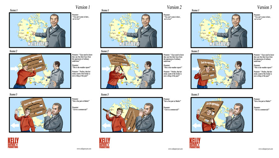
Friday, March 30, 2012
Pinup Study
Hey Gang,
Today we have a pinup study I did of a Keri Russel image I found on the net. I just thought it was such a good example of the pin up genre and I've always wanted to give Pinup style painting a chance so I decided to execute this study. I used both painter and Photoshop on this one and I think it took about 16 hours all in. Not too bad. Perhaps I will do more in the future.
Take a look and let me know what you think.
Cheers!

Reference Comparison

Close Up of the Portrait

Today we have a pinup study I did of a Keri Russel image I found on the net. I just thought it was such a good example of the pin up genre and I've always wanted to give Pinup style painting a chance so I decided to execute this study. I used both painter and Photoshop on this one and I think it took about 16 hours all in. Not too bad. Perhaps I will do more in the future.
Take a look and let me know what you think.
Cheers!

Reference Comparison

Close Up of the Portrait

Subscribe to:
Posts (Atom)